Simpson's Paradox is a classic example of a regression misleading interpretation.
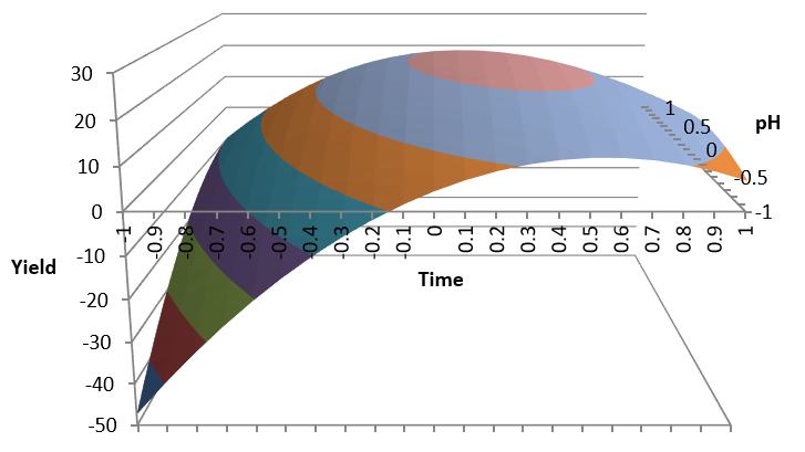
In this graph, looking at the overall data we see a positive correlation between daily exercise and junk food consumption: the more exercise, the more junk food consumption.
On the other hand looking at the age subgroups it seems the correlation is negative in each one of them.
How could negative correlation of each individual subgroup become positive when subgroups are compounded?
This effect when we compound data from several populations is known as Simpson's Paradox. We will analyze this effect with Microsoft Excel.

Download Excel file Simpson from OneDrive to your PC to run this analysis.
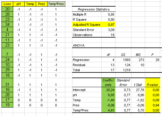
We have a process described by Y = f ( X ) and we know there is a correlation between input variable X and output Y so we try a linear regression between the two with Excel.
We select columns X and Y in the table and select a scatter chart.
We enter a linear trend option:
And we will get the scatter chart with the regression line and R-squared:
We notice that the approximation of this line is very poor and this is confirmed by a low R-squared value of 0.4.
The slope of the line shows a positive correlation between X and Y.
It is obvious that this simple mathematical model might not be acceptable due to the low R-squared: only 40% of the variation in Y is explained by the model.
In the graph we can see four clear differentiated groups of data which, in this example, correspond to another attribute factor which we will call G.
In this case this attribute was collected together with the data.
The
timestamp, for instance, may have been automatically collected.
G might be the shift, machine, operator, day of the week, etc.
It is obvious, by looking at the data, that output Y is affected by G as well as X.
Since we can discriminate the data with factor G we will analyse now each group separately with their regression Y = f ( X ):
We obtain different regression equations for each group G and the R-squared of 0.7 indicates the model is much better than the grouped data that was 0.4.
The other thing we notice is that the slopes of the regression lines are all negative as opposed to the grouped data. This is what Simpson's paradox is about.
We get a different result analyzing the groups separately and the grouped data.
But be aware that the approximation of the grouped data was very poor so the regression line would be a poor approximation to the data.
Input X Values
Another thing we notice analyzing the compound graph is that X values for each group are significantly different. Let us check that by making histograms of the X values for each one of the groups:
We confirm the X values for each group are significantly different.
We would need to understand why these X inputs are different for each group.
Attribute Example
Study of gender bias among graduate school admissions to University of California, Berkeley.
When comparing proportions it is important to take into account the sample size.
For these reasons we have computed the 95% confidence intervals in order to see if differences in proportion are statistically significant.
Looking at these intervals it is clear that:
- Overall proportion of admission for men is significantly higher than for women
- In department A proportion of admission for women is higher than for men
- In all other departments there is no significant difference in the proportions of admission for men and women
The research paper by Bickel et al. concluded that women tended to apply to more competitive departments with lower rates of admission, even among qualified applicants (such as in the English department), whereas men tended to apply to less competitive departments with higher rates of admission (such as in the engineering department)
So the conclusion in this case is that compounding data from the different departments makes no sense. There are other factors to consider:
- Competitiveness of the different departments/ rates of admission
- Preferences of the students
In this video Dr. Trefor Bazett shows the case of early Covid19 statistics comparing Italy and China fatality rates.
We notice that the total fatality rates of Italy were double those of China.
But if we compare by age group we notice that Italy's rates were ALWAYS lower than China's
How can we explain this contradiction?
The explanation comes from the age distribution of these two populations:
We notice that Italy's are very different to China's: more older people (> 70) in Italy and more younger people (< 60) in China.
We know that fatality rates are higher in older people so the higher fatality rate is explained by the age demographics of both countries.
This is another example of Simpson's paradox where compounding data (in this case of different age groups) gives a misleading result.
Conclusions
- A relation between two factors might be significantly affected by other factors we haven't considered
- Compounding data from different populations could lead to misleading conclusions
- A graphical representation can help to detect multiple populations which may require a specific analysis of each one
- Sample size is essential to interpret if statistical results are significant
- Statistics can't replace deep process knowledge: it can just help to understand it better
- Looking for a statistic that says what I want to hear is not always right


Comments
Post a Comment