Correlation and Regression with Excel
Correlation is a mutual relationship or connection between two or more continuous variables.
Regression is a mathematical model to define that relationship.
Process Data Analysis analyzed transfer functions Y = f ( X ) where X was an attribute. Now we will analyze the case of X being a variable.
Correlation
We have collected Natural Gas Demand data in sheet Correlation:
This is actual daily demand during the month of January and the average local temperature recorded on those days.
From the date time stamp we have computed the day of the week (1 being Monday).
We are looking for factors that may affect demand and two possible factors may be Temperature and DOW.
We will use Excel Data Analysis: Correlation
We see no significant correlation ( - 0.21 ) between day of the week and demand (no significant differences on weekends, for instance).
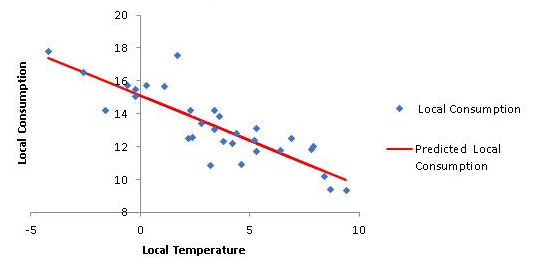
Date increase > Temperature increase > Demand decrease
Regression
Now that we see a strong correlation between temperature and demand we will apply linear regression to approximate a straight line to that relationship:
Results:
R square 0,73 indicates that 73% of the variation of the demand is explained by the variation in temperature.
The p-values of the coefficients are below 0.05 therefore the straight line is a good approximation.
Demand = 15.11 - 0.55 * Temperature
Residuals Analysis
Looking at the graph we notice the actual values differ from the predicted values represented by the straight line. The differences between the actual and predicted values are the residuals provided:
In order to validate this mathematical model we need to check that the residuals meet certain conditions. The first one is that they are stable along time. We will check that with an Individuals SPC chart:
We see no out-of-control symptoms so it meets this condition.
The second condition is that the average of the residuals is close to zero and they follow a normal distribution:
We notice the average is zero and the p value of the Anderson Darling Normality Test is 0.42 (well above 0.05) so it is normal.
This validates our mathematical model.
Multiple Regression
In sheet Multiple Regression we have collected output variable Y and input variables A, B and C.
We are looking for the relationship Y = f ( A, B, C ).
We will start with a correlation analysis among the 4 variables:
We see no significant correlation among the input variables but significant correlation between inputs and output Y.
We will now do a regression analysis:
Coefficient P-values below 0.05 also confirms its validity
The formula enables the estimation of output Y as a function of variables A, B and C
In this case we have no graph possible (we would need 4 dimensions)
Regression with Interaction
In sheet Regression interaction we have data of process Z = f ( X, Y ). We will try a linear regression to estimate Z as a function of X and Y:
We observe a poor value for R square ( 0.36 ) and we suspect that maybe there is an interaction between X and Y affecting the output Z.
To check that we add a column to our data to compute X * Y :
We will use this new column as another input to our regression equation: Z = f ( X, Y, X * Y ):
Now we see a much better R square ( 0.99 ) and therefore a much better estimate for Z.
The resulting formula for the estimate of Z will be:
Z = 10.26 + 3.92 X + 7.96 Y - X*Y
This is the 3D representation:
The maximum Z is for the maximum Y and minimum X
The lowest Z is for minimum Y and minimum X
Non Linear Relationship
We want to calculate the relationship Y = f ( X ) in sheet Quadratic. We start checking for correlation:
Let us look at the frequency distributions of X and Y:
We clearly notice Y = f ( X ) is far from linear. A quadratic formula such as Y = a X*X + b X + c should give a good approximation so we will add an X*X column to our data and do the regression with this additional column:
This is done by adding a trend line polynomial order 2 to the scatter chart.

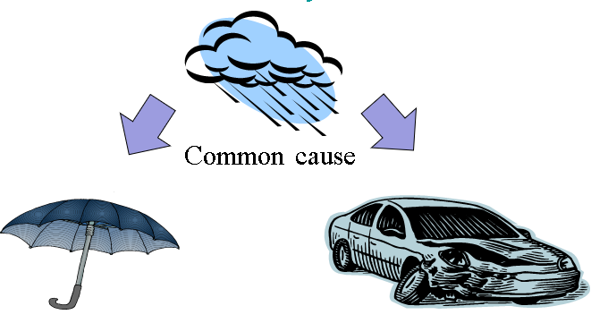
The rain is the common cause of the increase of umbrella sales and car accidents.
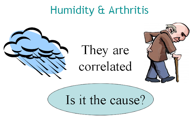
A good correlation is a necessary condition for causation between two factors but it is not sufficient.
Cause and Effect
There is a significant positive correlation in the city between umbrella sales and traffic accidents.

What is the cause and what is the effect?
It is obvious that none is the cause of the other.
Then how can you explain this correlation?
The answer:

The rain is the common cause of the increase of umbrella sales and car accidents.
So we conclude that significant correlation between two factors does NOT necessarily mean that one is the cause of the other: there may be a common cause of both.
Facts Misinterpretation
Another strong correlation is between rain and arthritis, specially among the elder.
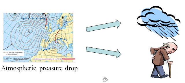
Also in this case the actual cause of arthritis is not obvious.

It is the drop of atmospheric pressure that causes both:

A good correlation is a necessary condition for causation between two factors but it is not sufficient.
Conclusions
- When there is a significant relation between two variables this can, normally, be approximated with a formula
- To be able to estimate one as a function of the other the cause - effect relationship need to be established clearly.
- In case of doubt design of experiments (DOE) may help
- If we have a good correlation a linear regression can be a good approximation (a straight line)
- Residual analysis provides additional confirmation of the mathematical model
- An output variable in the process may be correlated to several input variables: we can calculate a regression equation also in this case
- A non-linear relationship can normally be characterized by a higher level polynomial equation rather than a straight line.
- We can do this with Excel Data Analysis.



Comments
Post a Comment