Excel VSM Simulator


A still picture of a Value Stream Map may not fully explain the behavior of the Value Stream. In some cases we need to understand its dynamic behavior. To do this we will convert our Excel Value Stream Map into a Monte Carlo Simulator.

In Excel Value Stream Map we saw how a complex Value Stream could be mapped using Excel. We saw the importance of mapping feedback loops such as test-repair loops because they may become the bottleneck for the complete value stream. In this situation not all items flow along all branches so we need to calculate the % flowing along each branch. This enabled us to calculate the cycle for each workstation based on the staffing. Finally we were able to calculate the ideal staffing to balance the line: insure no workstation cycle is above the average inter-arrival time (takt time). This we did using Solver.
Value Stream Map: Still Picture Vs Dynamic Behavior
Mapping the current value stream is a good starting point to understand how it behaves but this instant picture may not be representative of its behavior in the long run.To further analyze the value stream behavior we need variation data on its critical parameters such as:
- Inter arrival times
- Process times
- First Pass Yields
A value stream map is not complete without Work-In-Process (WIP) data. The problem with WIP data is that it typically varies widely along time so a snap shot of the moment we visit the line may be very misleading. In our VSM Simulator WIP before each workstation (column Q) is calculated each hour based on historical data collected:
New WIP = Previous WIP + Items processed by previous step – Items processed by this step

Items processed (column R) are calculated each hour based on Average time (K), Time Standard deviation (L) and Staffing (M) taking into account the constraint of enough WIP in the previous step.
Gemba data collection to estimate process standard deviations
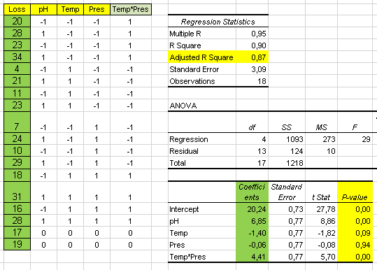
We need to measure inter arrival times and process times for each process step. To do that we take 10 measurements of each in Gemba and calculate the average and standard deviation:

Process times: Normal distribution with averages (K) and standard deviations (L)


Inter arrival time distribution: Exponential with average in K3 (5.0 min)
We now enter these averages and standard deviations in columns K and L of our simulator.

Lead time and capacity utilization
Capacity utilization in column U is the average % time the workstation has been operating since the start of simulation based on its theoretical capacity.
WIP (Q) and Capacity Utilization (U) are shown on bar charts on the right:

Total products received and returned
Elapsed hours simulated are in B2. Products received for repair, products repaired and products returned without repair are shown in column A:

Overall process parameters
Total values for columns K to U are shown in row 1:
M1 is the total staffing in the line (Full Time Equivalent)
P1 is the maximum value of all cycle times: it corresponds to the line bottleneck capacity.
P1 should be ≤ K3 (Takt)
Q1 is the total WIP in the line.Products received for repair should still be in the line (WIP) or they should have been returned to the customer repaired or unrepaired:
Received (A3) = WIP (Q1) + Repaired (A13) + Returned without repair (A8)
U1 is the overall line capacity utilization.
The Value add to total time rate can be calculated:
Value Add Time / TOTAL Time = K1 / (T1 x 60)
In this case: 66 / (32 * 60) = 3.43 % of the total lead time (32 hours) seen by the customer we are adding value.
To run the simulator:
- Press F9 to simulate 1 hour. Keep pressing to run several hours. The counter in B2 shows the elapsed simulator hours.
- To start simulation with an empty line: press Ctrl key + r or press the Reset button. This will reset all line WIPs to zero.
- To simulate 100 hours press the RUN 100 button

Evolution graphs
In the tab Evolution you can see how all Process and WIP values evolve along each hour in the main steps as well as the evolution of total Lead Time:
During the first hours, when the line is empty, there is no waiting time along the process so the total lead time is basically equal to the value add time (one hour). As queues start building up as shown in the WIP chart, waiting time starts to increase in all workstations and that causes the total lead time to increase to a value of 20 hours, where it seems to stabilize. This means that if we take a snap shot of the line in hour 7 total lead time is 8 times value add time. On the other hand if we look at the line in hour 45, when stability seems to be reached, lead time is 20 times value add time: NVA/ VA = 19. Non value add time is made up of all the waiting taking place in front of each workstation.
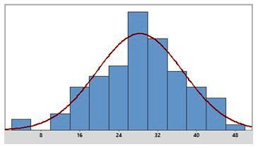
We can see that, although the average inter-arrival time is 5 min (12 items per hour), 3 arrivals of more than 30 items each have collapsed receiving causing an accumulation of 100 items in reception which has eventually been absorbed by the line.
This is a typical case where most of the variability comes from the customer inter arrival times as seen in the process chart.
Tracking this evolution you can discover unexpected bottlenecks caused by variability that may need to be reinforced with additional staff. We can also estimate the total lead time we can commit to customers. In this case if the process is stable that would be 20 hours minimum.
In this case most variation is coming from the arrival times from the customers so that will be difficult to reduce.

These small increases have increased the overall staffing by 1 person and in this way we have reduced their capacity utilization. You can now see that their cycle has been reduced well below 5 (the takt time). The end result will be a reduction of the average overall lead time for the line.

We can see the line performance along time now:


The first thing we notice is a red alert in the Repair and Test Cycle times: they are now above the Takt time defined by the average inter arrival time in K3. This means these operations have become the bottleneck for the total value stream.

These are some of the effects we can detect in our simulation:
- Accumulation of WIP in front of a workstation due to insufficient staffing
- Low capacity utilization due to excess staffing
- Accumulation of WIP in front of the repair station due to low first-pass-yield in test (N11)
- Accumulation of WIP in reception (Q4) due to arrivals above plan
- High overall lead time due to excess total WIP in the line
- Test first pass yield below plan which would create a bottleneck both in the test and repair stations
- Highly unbalanced line as shown by large differences in capacity utilization
- Proportion of products under warranty different to plan: it would require line re-balancing
Capacity Utilization Analysis

These small increases have increased the overall staffing by 1 person and in this way we have reduced their capacity utilization. You can now see that their cycle has been reduced well below 5 (the takt time). The end result will be a reduction of the average overall lead time for the line.
We can see the line performance along time now:
Test First Pass Yield Drop Simulation
We want to find out what would be the effect of a drop in test First Pass Yield from the planned figure of 80% to 70%
The first thing we notice is a red alert in the Repair and Test Cycle times: they are now above the Takt time defined by the average inter arrival time in K3. This means these operations have become the bottleneck for the total value stream.
Looking at the evolution we see a WIP build up first in repair and later on in test:
In a situation like this we would analyze the failing items to look for the root cause of their failures to correct it. But on the mean time, if we need to continue the process, we will need additional test and repair capacity (increase test and repair staffing).
In a situation like this we would analyze the failing items to look for the root cause of their failures to correct it. But on the mean time, if we need to continue the process, we will need additional test and repair capacity (increase test and repair staffing).

We have increased Repair from 7.1 to 7.7 and Test from 2.4 to 2.6 to achieve cycle times of 5.
Conclusions:
- A static Value Stream Map is a good start to understand how the value stream behaves
- Feedback loops such as test-repair loops are an essential part of the value stream so they should be included in the VSM
- A snap shot of the WIP situation along the line may not be representative of the normal operation
- If the WIP situation is not typical the NVA calculation will not be correct
- The VSM simulator provides a deeper understanding of the process behavior and it enables what-if studies to optimize the process
- Simulation helps us understand some of the failure mechanisms caused by variation so we can act on the root cause to make real improvements

I love your work Cornelio. I think the impact of variation on VS mapping is underappreciated. Gary
ReplyDelete